If you want to understand the collective psychological state of the world right now, stop reading the news and start looking at the fonts on your consumer packaging.
No, I’m serious.
I don’t know if y’all noticed. But for the better part of the last decade, consumer design was locked in a vice-grip of sanitised sans-serif.
Every single trendy direct-to-consumer brand looked identical. Flat pastel backdrops, perfectly symmetrical layouts, and clean, sterile, sans-serif typography. It was the visual language of optimisation. A frictionless aesthetic designed to make you feel safe, compliant, and calm.
But over the last few months, a chaotic, unruly new visual movement has exploded across the fashion, typography, and consumer packaging industries.
And I couldn’t be more welcoming.
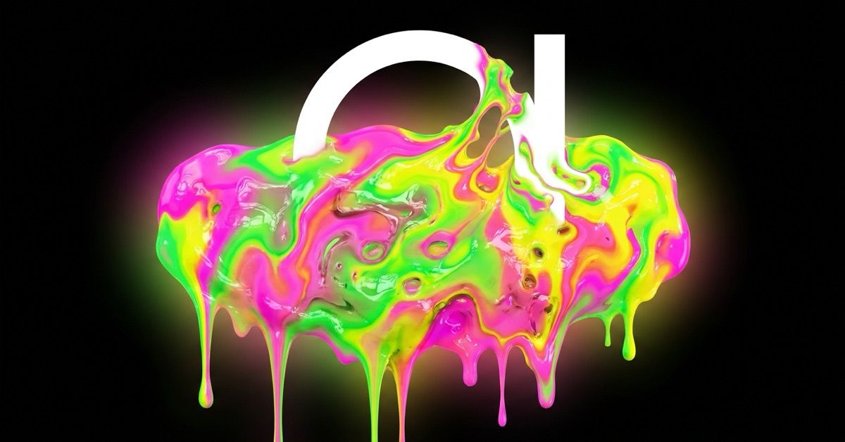
I recently read in The New York Times that the design world is going completely feral for an aesthetic people are calling Hyper Goo.
And it’s everything you think it is. We are talking about melting, liquid textures, distorted and almost illegible typography, hyper-saturated neon colour palettes. It’s glitchy, gloppy, beautiful maximalism.
To some, this seems like it’s just a random shift in creative direction. But it’s actually a profound psychological immune response. Consumer design has always served as a direct mirror of geopolitical and cultural stability. And, right now, the mirror is melting.
To understand why the culture is suddenly craving distortion and chaos, we have to look at how modern history has used design to cope with reality:
The 1950s: The Illusion of Order (Mid-Century Clean)
- The Mood: Post-war anxiety masked by forced corporate optimism and nuclear-family domesticity.
- The Aesthetic: Rigid grids, geometric patterns, and the birth of Helvetica. The design goal was to project absolute stability, control, and structure to a public that had just survived global trauma.
The 1970s: The Psych-Out (The Bubble Font Rebellion)
- The Mood: Geopolitical instability, economic recessions, and profound institutional distrust.
- The Aesthetic: Thick, melting, psychedelic bubble fonts and warm, muddy, earth-toned palettes. As the world outside felt increasingly harsh and dangerous, design melted its hard edges, retreating into soft, organic, and slightly surreal comfort.
The 2010s: The Corporate Lobotomy… womp womp (The Sans-Serif Flattening)
- The Mood: The rapid centralisation of Big Tech, algorithm-driven lifestyles, and data optimisation.
- The Aesthetic: "Blanding." Every brand from high fashion down to mattresses adopted the exact same frictionless, minimalist sans-serif font. It reflected an era that idolised ease, predictability, and safety. It smoothed over every human edge to make consumption as mindless as possible.
The Present Day: Hyper Goo (The Visceral Backlash)
- The Mood: Profound over-stimulation fatigue, geopolitical volatility, and an existential dread of synthetic, AI-generated perfection.
- The Aesthetic: Gloppy, liquid maximalism, slime-like textures, and heavily distorted text that actively resists legibility.
So, why are we embracing the glop?
It’s basically a direct, aggressive middle finger to the frictionless world of generative AI and corporate minimalism.
AI can instantly output a perfectly balanced, hyper-clean vector graphic in milliseconds. So now, clean minimalism ceases to signal high-end luxury. Instead, it starts to feel cold, fake, and f*cking boringggg.
Humanity naturally craves the messy, the tactile, and the un-optimised. Texture, colour, nature is full of these things, so a world without that feels anything but natural.
Hyper Goo delivers a visual celebration of things that feel organic, volatile, and deeply emotional.
I know I sound ridiculous, like c’mon Sophie, it’s a font for fks sake. But it’s true. These are the things that define eras and the cultural zeitgeist.
And by forcing typography to melt, warp, and distort past the point of immediate readability, designers are performing a radical act of ownership.
They are reflecting the real, unstable, and chaotic emotional landscape of living through 2026.
The trend proves that you cannot capture the modern human experience inside a clean corporate box. Sometimes, to express something real, you have to let the paint run and the lines warp.
-Sophie Randell, Writer