Y’all, I have to break it to you. We have finally gone full circle (yet again.)
For the past few years, fashion gatekeepers and consumer lifestyle designers completely suffocated us with the rigid gospel of Quiet Luxury and Succession-core.
They tried convincing the fashion world that wealth, style, and cultural relevance were defined entirely by an anonymous beige cashmere sweater, a blank baseball cap, and looking like an un-marked hedge-fund manager hiding out at a high-end wellness retreat.
It was an aesthetic of pure, passive exclusion. One designed to make consumer habits look invisible, safe, and entirely compliant with a clean, minimalist digital landscape.
Every single direct-to-consumer brand looked identical.
They all utilised the same flat pastel backdrops and sterile layouts to convince us that true elegance was the complete absence of personality. LOL. The irony.
Because the novelty of that muted luxury performance has worn tf off. And the modern consumer base is hitting an absolute wall of profound minimalism fatigue.
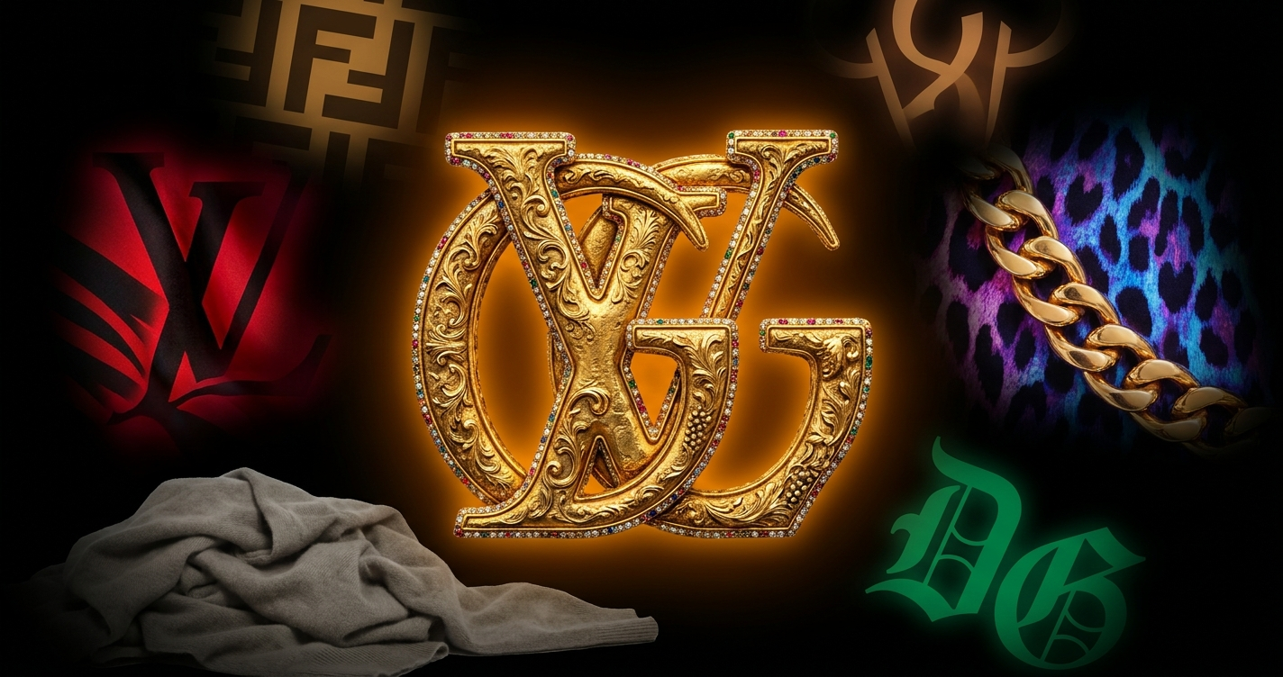
Now, we are facing an unapologetic resurgence of logomania. Visual noise is aggressively reclaiming the street and reshaping the visual vanguard. Because consumers are over trying to look understated, polite, and algorithm-friendly (sanitised and conformist).
They want the obnoxious, oversized graphic print. The bootleg luxury monogram. The clashing palettes. And the heavy structural textures that actively demand immediate attention.
Welcome back the cultural rejection of the sanitised design language that big tech, tradwives and corporate committees have spent the last 5 years forcing down our throats.
When you look closely at why this visual explosion is happening right now, it reveals a super interesting psychological shift in how we handle digital saturation. In the current landscape (where generative software can output a perfectly balanced, hyper-clean minimalist asset in a fraction of a second) sterile cleanliness has lost all its premium value.
It doesn’t signal high-end luxury or elite taste anymore. It signals compliance tbh, and a lack of human edge. Looking loud, messy, and intentionally unoptimised is 1. hot as fk, and 2. has become the ultimate luxury premium.
Because it carries a human pulse that a machine couldn’t replicate even if you implanted my entire brain into it.
By plastering our bodies and our packaging in giant logos and distorted, chaotic typography, we are performing some kind of radical act of creative ownership.
We're reclaiming the right to be visually complicated in a world that wants to sand down our edges.
This is a roll call to the messy, loud and “out the gate” brands that felt cast aside by the blanding movement of the last few years of our sad beige lives.
Your time is now. Safety has become a form of white noise (both figuratively and literally) on the feed.
To cut through the clutter, embody your existing institutional courage to embrace visual tension. Lean into the high-contrast compositions, oversized branding elements, and aggressive, saturated colours that force the scrolling user to stop and pay attention.
You aren't trying to fit seamlessly into their curated aesthetic anymore; to be frank, you never were.
Do what you were always meant to do: break the trance.
We’re done with the performance of invisible luxury. We want the weight, the drama, the noise of real human expression back on our screens and in our wardrobes.
Grab your black eye pencil and your biggest oversized shirt.
Messy is back.
-Sophie Randell, Writer