
It can't be just me noticing that over the last few years, someone has reached over the cultural soundboard and slid the saturation dial alllll the way down.
Why is everything giving that one fashion guy's Instagram who takes the "gritty" aesthetic too far and I have to turn up my phone's brightness just to make out the silhouette of his filthy Rick Owens (someone please ban him from VSCO btw.)
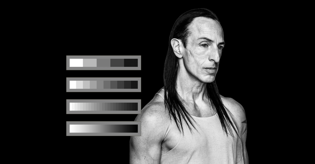
Films look washed. Ads look washed. Your friend's Instagram feed looks washed. Even the new logos for major streamers are going grayscale like they're attending a funeral.
It's so bad, that even
Raz Cunningham wrote a piece about this exact phenomenon. And despite their disability, they can tell the world is losing its colour. When the literal colourblind guy sounds the alarm, you know something deeper than "aesthetic trends" is happening.
This goes beyond "blanding," a phenomenon I wrote about last year. It's everywhere, tainting everything with Chic Bleakness. It's desaturation bleeding from our screens into the collective mood.
Look around. Everything looks like a TV drama about a detective who hasn't slept since 2009.
Cunningham uses the example of Ridley Scott's Napoleon. What should have been a film built on vibrant French costuming and theatrical set design was instead flattened into steely blue-grey nothingness in post-production.
MAX (formerly HBO Max) retired its distinctive royal blue for a stark black-and-white wordmark. Fashion has collapsed into a sea of neutrals. TikTok's favourite filters turn you into a desaturated porcelain ghost. Even street posters look like someone sucked the life out of them with the Photoshop sponge tool.
Bright colour has become "tacky." Seriousness, taste, maturity, all encoded in grayscale. It's like the entire culture decided the only acceptable palette is "morally ambiguous desert."
Where did it all go?
Colour used to be a flex. Think early-2010s internet aesthetic: Tumblr deep-blues, millennial sunset filters, neon signs in every café that read something embarrassing like "good vibes only."
We were drowning in colour.
Now colour is seen as childish, tasteless, cheap. Muted, minimal, neutral is high status (we can thank a certain Mr. West partially for this curse).
This shift tracks with how marketing has evolved:
Neutrals = credibility
Desaturation = prestige
Textureless black = "grown-up brand trying very hard to be taken seriously"
The Dark Knight
Gritty realism became synonymous with artistic credibility. The desaturated palette became shorthand for "serious cinema." And eventually the whole industry adopted it like a dress code.
But this isn't just Hollywood. Brands followed suit because their deepest fear is appearing unserious. Everything became tasteful. Safe. Monochrome. Flat.
Your favourite tech company wants to look like Succession, not Skittles.
The cultural mood board is... bleak AF.
This desaturation totally matches the cultural emotional palette. This time, it's not aesthetic leading culture, but culture driving aesthetic.
We're in a permacrisis. Economy wobbling. Climate dread humming nonstop in the background. Governments doing government things (badly). AI accelerating faster than anyone can process. Social media frying everyone's nervous systems. Dating culture on life support. Loneliness epidemic at peak.
When the vibes are flatlining, the visuals follow.
We don't want neon optimism. We don't want 2016 "spray everything with millennial pink." We don't even want the saturated surrealism of the early TikTok era anymore.
We want calm. Control. Quiet. We want images that match the emotional numbness we've developed as a survival tactic.
Muted tones are the psychological version of noise-cancelling headphones.
There's a reason the "sad beige parent" discourse blew up. Neutrals feel like safety when everything else feels chaotic. A beige living room is a small, controlled universe when the outside world resembles a freaking biblical plague highlight reel.
Colour overload feels like stimulus. Muted palettes feel like rest, I guess?
Even brands are leaning into monochrome. Not just because it's tasteful, but because it telegraphs stability in a world where everything feels anything but stable. A black-and-white logo is a visual Xanax. And we're popping like a sadboi rapper from the mid-2000s.
Yeah, the world is losing colour. But we kind of asked for it.
Culture never stays in one spot, especially not for long.
We've hit peak grayscale saturation, which means colour is inevitably about to fight its way back. Thank the lord.
We're already seeing cracks:
TikTok teens reviving Y2K rainbow maximalism
Indie fashion labels bringing back neon brights (love you, Addison Rae.)
Colourised historical footage going insanely viral
Film fans begging studios to stop releasing movies that look like they were shot through a sock
Even in marketing, the pendulum is twitching. Notice how the most exciting brands right now (youth culture, alt beauty, niche creators) are sneaking colour back in? Bold, intentional vibrancy is officially back on the menu.
We're craving something that feels alive again.
Is desaturation an end-times indicator?
Here's the part where I should say no, relax, everything's fine. But I won't insult you. Because I also need to hear that myself.
Aesthetics always reveal what a culture is too afraid to articulate directly. If everything looks drained, dull, and washed out, it's because we feel that way: overstimulated, under-optimistic, and stuck in a timeline that feels increasingly surreal.
But it's also a signal.
Culture mutes itself right before it bursts.
Think about it: Every time society buckles under pressure, colour comes roaring back.
The 60s psychedelia followed the 50s austerity. The 90s technicolour rave era followed late-80s burnout. Late-2000s hyper-colour came after the grayscale recession mood. We mute, then we explode.